The results
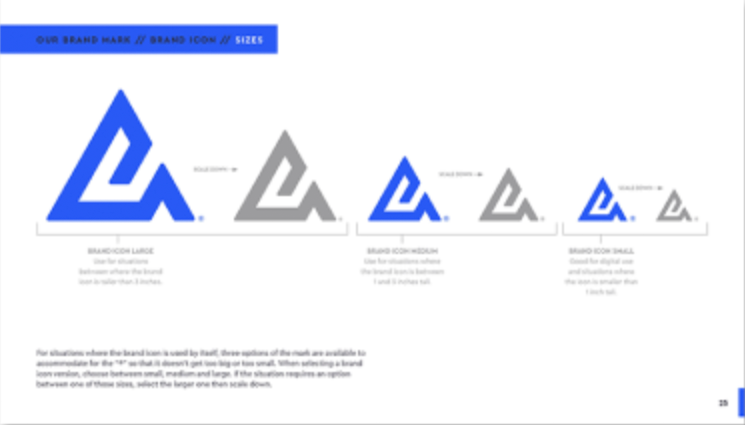
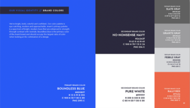
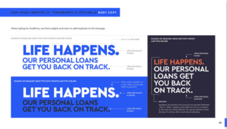
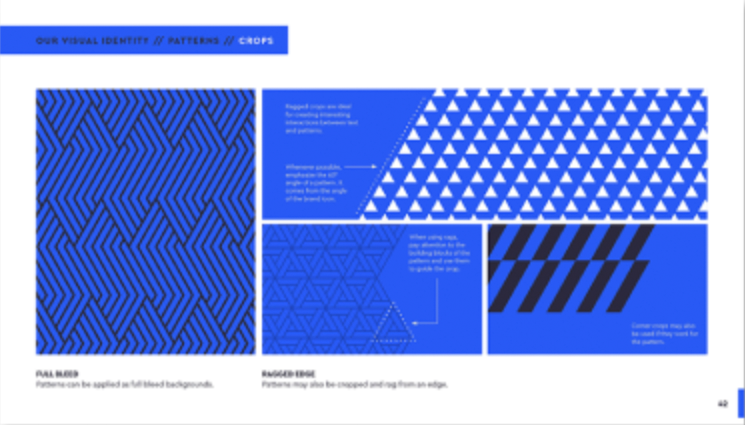
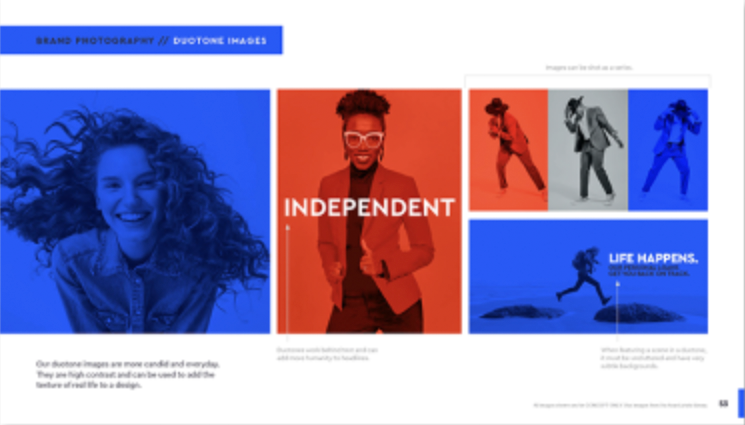
We helped Avant capture their ethos — the belief that when it comes to your finances, character counts. We positioned the company as a partner that empowers people to move their financial lives forward. We built a brand dedicated to championing this underserved group, one that honors their journey and furthers their aspirations. Through vibrant colors, dynamic patterns, empowering language, and inspiring photography, the new brand communicates a clear, bold and determined message: We’ve got what it takes to help you move financially forward.
“The new visual identity and brand strategy reflect Avant’s history, evolution and renewed commitment to empowering more people to move forward on their financial journeys”
— Matthew Bochenek, CEO, Avant
The challenge
Avant is a fintech company that strives to eliminate the barriers to borrowing. They bring transparent access to credit for non-prime/middle-income consumers or those who fall outside of the traditional standards of creditworthiness. The Avant brand identity and visual design were limiting the ability to expand into products that could further benefit their audience.
The solution
With Favorite Child, the brand design arm of Betty, a Quad agency. We set out to champion financial “go-getters” along their journey by celebrating their diverse lived experiences and recognizing the obstacles they face. We started by understanding the truth behind what motivates the Avant consumer:
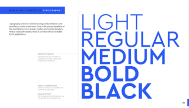
From there, we were able to build visual assets and a brand voice that would express Avant’s desire to honor their experiences.

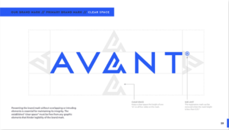
As a digital-first financial solution, it was essential that the Avant website adequately represent the brand and its key audiences. Once we got that right, it was time to expand the brand into:

