In the world of consumerism, packaging isn’t just a means to an end—it’s an art that transforms products into memorable experiences. In Quad’s latest playbook, “#LittleTreats: How CPG brands can turn everyday products into little luxuries,” we dive into why consumers have the urge to splurge on these experiences, and what tools brands can equip themselves with to meet these demands.
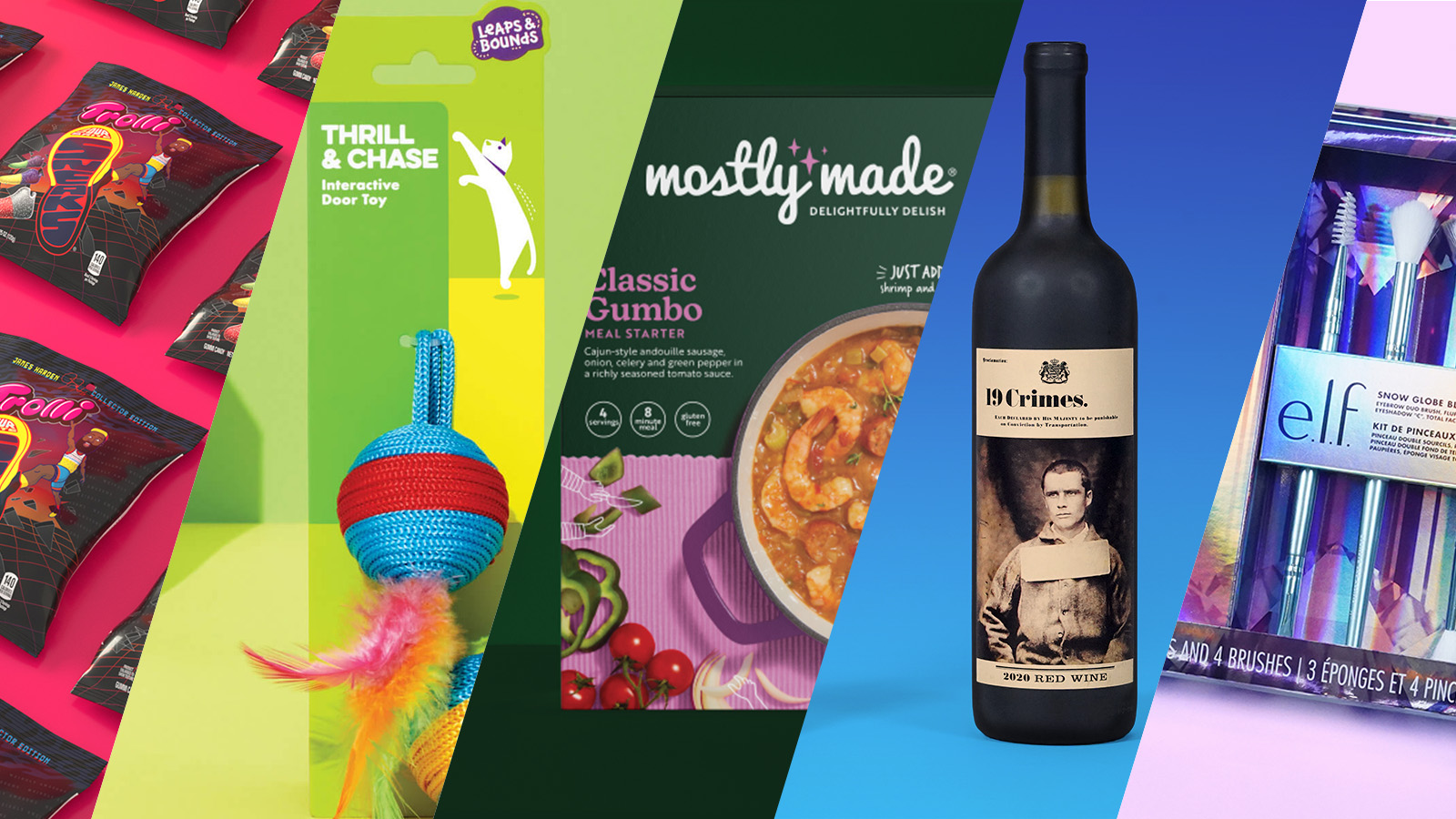
And the primary way brands can elevate their everyday items is through inventive experiential package design. The following examples showcase the ingenuity of packaging, delivering an immersive experience that feels like a luxurious indulgence without the hefty price tag.
A sole-ful experience: Trolli x Harden
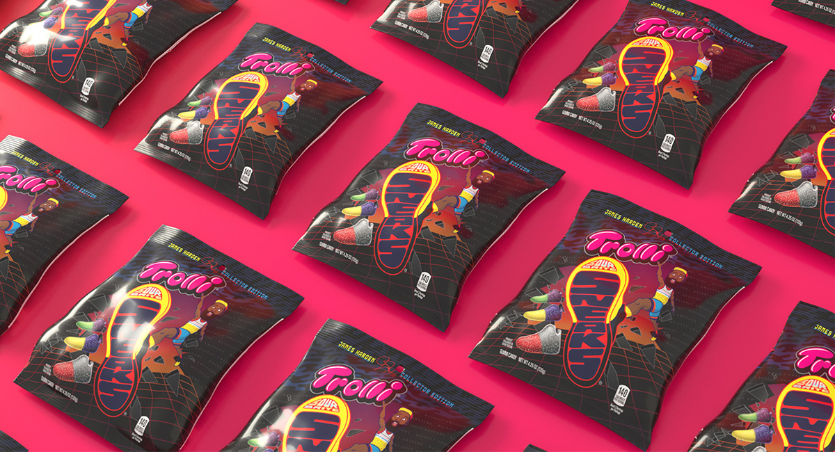
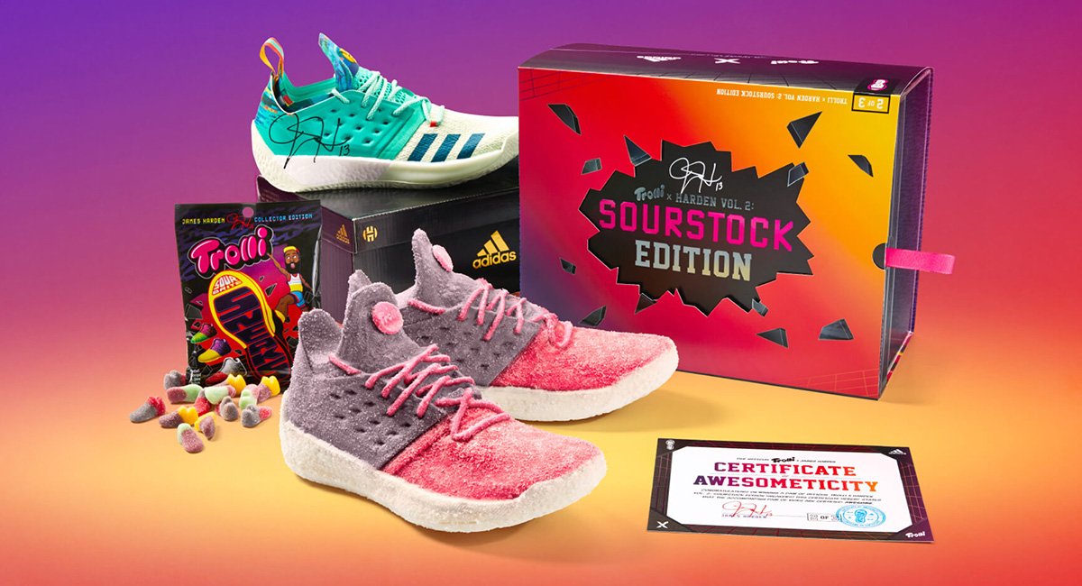
The collaboration between Trolli, Adidas and NBA All–Star James Harden, orchestrated by Favorite Child, didn’t simply create killer sneaker packaging; it crafted an entire experience. The team behind this product not only stunned with bright and colorful packaging, but created shoe-shaped gummies that treat-ified the soon-to-drop Harden Vol. 2 sneaker.
And it worked! The campaign received just shy of a billion media impressions and Trolli’s “shoegary” treat became 7-Eleven’s top selling non-chocolate product.
Built on Quad
Packaged plots: 19 Crimes
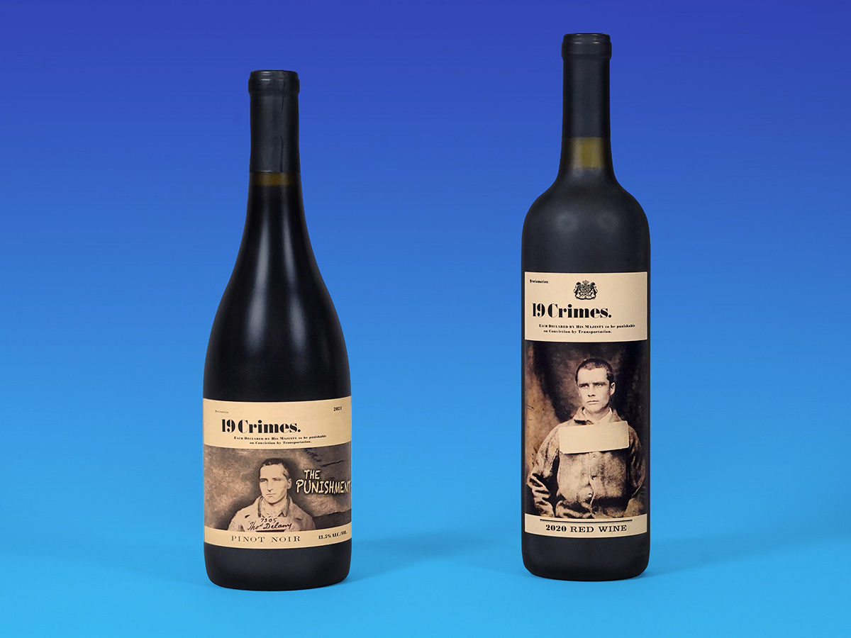
The most compelling package design tells customers a story, and 19 Crimes exemplifies this with their signature design and messaging infused with augmented reality.
19 Crimes transforms wine into a unique, interactive experience. Historical criminals depicted on labels come to life through QR codes, blending tradition with technology. This engaging approach sparks curiosity and storytelling, making each purchase a treat-filled adventure.
Simplicity unleashed: Leaps & Bounds
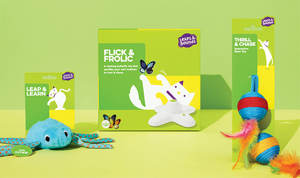
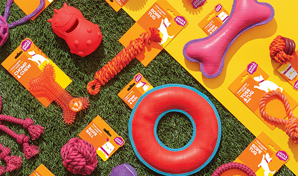
Leaps & Bounds’ packaging triumph promises fun for pets and ensures excitement for the furry-friend owners, too. Cleverly, the design team chose to differentiate their line by color: green for cats, orange for dogs adding ease and intuition to the end-user experience. By leveraging these bold leaps of color, the products evoke a sense of excitement and anticipation that grabs consumers.
Additionally, the clean and simple design elements embody Leaps & Bounds straightforward promise for safety and holistic pet-health. As Favorite Child says of the collaboration, “Packaging for pet toys should be as fun for pet owners as the toys are for pets.”
Built on Quad
Wholesome luxury: Mostly Made

When Mostly Made transitioned its pre-assembled meals from the freezer aisle to the deli, designers at Favorite Child made sure to infuse luxury and indulgence into the rebrand.
Recognizing its role for busy families, the package design used warm colors, natural textures and graphics depicting the cooking process to tell the story of happy, healthy, wholesome goodness. Paired with eye-catching images of fresh and delicious food, the refrigerated meal kits deliver a promise of nourishment and nurture that consumers crave. Buyers love treating their families with these dinners––after the redesign, purchases increased 2.5x!
Built on Quad
Eye makeup as eye candy: e.l.f.
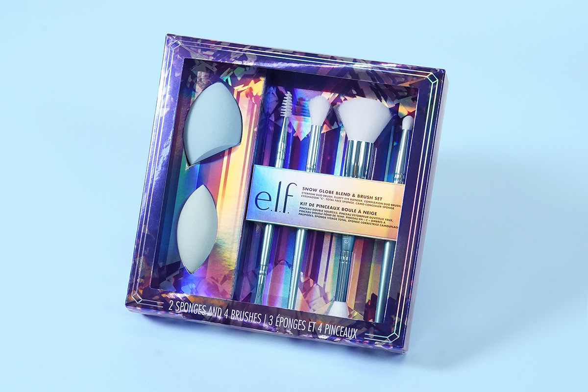
When it comes to a culture of treating yourself and others, cosmetics take the lead in providing moments that are low on cost but high on impact. Beauty brand e.l.f. excels at delivering luxurious experiences through creative package design with its limited-edition Snow Globe Blend and Brush Set. With a sleek and shimmery design, complete with opulent crystal imagery, e.l.f.’s holiday set exudes indulgence and oozes luxury.
How can you elevate everyday items?
As consumers seek satisfaction without compromise, these packaging innovations show how excellent presentation can turn everyday items into memorable moments of delight.
Learn more about how Quad is championing the #LittleTreats trend for CPG marketers by downloading our playbook, “#LittleTreats: How CPG brands can turn everyday products into little luxuries.”
